Customer service analytics explained: Metrics that actually improve satisfaction
Sneha Arunachalam .
Jan 2026 .
Most companies think they understand their customers. The data says otherwise.
Customer service analytics reveals what customers actually experience and not what surveys claim. Used right, it exposes churn risks early, cuts support costs, and turns service into a growth engine.
In this guide, you’ll learn which customer service metrics truly predict satisfaction and loyalty, why traditional KPIs fall short, and how modern Customer service analytics helps teams spot friction and prevent churn in real time.
Understanding customer service analytics and its role in satisfaction
Let's break this down — customer service analytics is basically turning every conversation, email, and chat into useful intelligence. Instead of just handling tickets as they come in, you're spotting patterns that help you get better at solving problems.
Here's where the data comes from: phone calls, emails, live chats, social media mentions, and customer surveys. Think of it as two buckets:
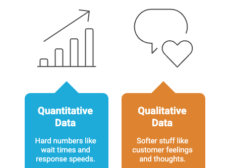
- Quantitative data: The hard numbers — wait times, response speeds, which agent helped, what channel the customer used
- Qualitative data: The softer stuff — how customers feel, what they think about your product, how you stack up against competitors
Now here's the interesting part. Even though most leaders know this stuff matters, only 44% of service teams actually consider themselves data-driven.
Compare that to marketing and sales teams where more than half are already there. That's a pretty big opportunity if you ask us.
The connection between good analytics and happy customers isn't subtle. Companies that really analyze their interactions see satisfaction rates go up by 20%.
Yet 93% of customer experience leaders still rely mainly on surveys, and only 15% feel good about how they're actually measuring things.
What makes modern analytics different?
Traditional surveys ask customers how they felt after everything's done. Modern analytics tracks what's happening while it's happening. You get the full picture instead of just the ending.
There's something called customer agility — how quickly you can adapt when customers need something different. Research shows this actually bridges the gap between having good analytics and seeing better satisfaction scores.
When markets get crazy, this becomes even more valuable.
Here's what good customer service analytics actually does for you:
- Performance measurement: Track the metrics that matter — satisfaction scores, how often you solve things on the first try, how long calls take
- Trend spotting: See patterns in customer behavior before they become obvious. This helps you stay ahead of what people need
- Operational efficiency: Use data to figure out where you're wasting time or money. Some companies cut support costs by 15-20% this way
- Personalized experiences: Group customers by what they actually do, not just demographics. Then treat them accordingly
- Proactive problem solving: Catch issues before they blow up into complaints
This is exactly where the right tools make the difference between having data and actually using it.
Platforms like SparrowDesk are built around this shift — turning everyday support conversations into real-time insights instead of static reports.
Rather than relying on after-the-fact surveys, SparrowDesk brings analytics directly into the support workflow.
Teams can see resolution trends, effort signals, backlog risks, and sentiment as conversations happen — across email, live chat, and other channels — so they can act before small issues turn into churn drivers.
By combining unified inbox data with AI-driven insights, SparrowDesk helps support teams move from reactive reporting to proactive decision-making — exactly what modern customer service analytics is meant to enable.
AI-powered support insights with SparrowDesk.
Here's a stat that'll get your attention — companies using analytics make decisions 2.6 times faster than those flying blind. That speed matters when customer expectations keep rising.
The benefits compound over time too. Start using analytics now, and you're building a foundation for better satisfaction down the road. Your analytical skills get sharper, and the results get better.
Consider this: 94% of customers say good service makes them more likely to buy again. Analytics helps you deliver that good service consistently.
Bottom line? Don't just collect data for the sake of it. As Harvard Business Review puts it, you need "a 360-degree view of each customer, using the expanding range of possible ways to capture new signals from each one".
Focus on insights that actually change how you operate.
8 Hidden customer service metrics that actually matter
Most companies obsess over CSAT and NPS scores. But here’s what they’re missing — customer service analytics that reveal the metrics actually predicting whether customers stick around or bail. These eight indicators show what’s really happening behind the scenes.
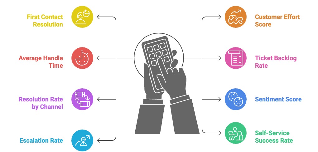
1. First Contact Resolution (FCR) and its effect on loyalty
Think of it like this: when someone calls for help, they want their problem solved. Not passed around. Not put on hold for three transfers. Solved.
First Contact Resolution tracks how often you actually pull this off. Top-performing contact centers hit FCR rates of 74% or higher. Here's why that matters — 96% of customers who have to work hard to get help become disloyal, compared to just 9% who get easy resolutions.
The math is simple: (Number of issues resolved on first contact ÷ Total contacts) × 100
Aim for 70-80% FCR, with anything above 85% being excellent. High FCR rates don't just make customers happy — they cut your operational costs and build trust.
2. Customer Effort Score (CES) for measuring ease of service
Let's be honest — nobody wants to work hard to get basic help. Customer Effort Score measures exactly how much energy customers have to spend getting their issues resolved. Most tools use a scale from "very easy" to "very difficult".
The numbers are pretty stark: 94% of customers with low-effort experiences plan to buy again, versus just 4% who had to jump through hoops.
Calculate it this way: Sum of all ratings ÷ Number of survey responses
CES actually predicts loyalty better than satisfaction scores, especially after support interactions. Target a CES of 1.5-2.0 on a 1-5 scale (remember, lower is better here).
3. Average Handle Time (AHT) and its link to agent efficiency
Here's where things get tricky. Average Handle Time measures how long agents spend on each interaction — talk time, holds, follow-up work, everything. Industry standard sits around six minutes.
But faster isn't always better. Rushing customers off the phone might hurt your FCR and satisfaction scores. Smart companies balance AHT with quality customer support KPIs like First Contact Resolution. Sometimes spending an extra minute upfront saves you three follow-up calls later.
4. Ticket Backlog Rate and its impact on wait times
Picture this: tickets piling up on your team's desk while new ones keep coming in. That's your backlog, and it's a crystal ball for customer frustration. Growing backlogs mean longer wait times, which means angrier customers and overwhelmed agents.
Keep your backlog under 10% of daily ticket volume. So if you get 100 tickets a day, you want fewer than 10 sitting unresolved at closing time. Simple benchmark, big impact.
5. Resolution Rate by Channel (email, chat, phone)
Not all channels work the same way. Your phone team might rock at solving complex issues while your chat agents excel at quick fixes. Resolution Rate shows you these patterns by tracking what percentage of tickets get resolved within your timeframe across different channels.
Different channels, different expectations. The formula: (Number of Resolved Tickets ÷ Total Number of Tickets Received) × 100
This tells you where to send specific types of problems and where your team might need more training.
6. Sentiment Score from customer interactions
Traditional metrics miss something crucial — how customers actually feel during interactions. Sentiment analysis uses AI to detect emotions like frustration, anger, or gratitude in real-time. Unlike basic surveys, it catches the nuanced stuff that numbers can't capture.
Most tools score interactions on a 0-10 scale, with higher numbers meaning happier customers. This data helps you spot churn risks before customers actually leave and enables more empathetic responses.
7. Escalation Rate and its correlation with dissatisfaction
Every escalation tells a story — usually about knowledge gaps, training issues, or product problems. Escalation Rate tracks how often tickets get bumped up to higher-level teams or management.
The formula: (Number of escalated tickets ÷ Total tickets) × 100
Keep escalations below 10%. Higher rates strongly correlate with customer dissatisfaction because nobody likes getting passed around. Each transfer adds frustration to an already stressed customer.
8. Self-Service Success Rate from knowledge base usage
Here's the thing about self-service — customers actually prefer it when it works. Self-Service Success Rate measures how often people can solve their own problems without contacting support. When done right, it's a win-win.
Calculate it: (Self-service resolved inquiries ÷ Total customer inquiries) × 100
Track failed searches to spot content gaps. If customers keep searching for something that's not there, that's your cue to create it. Good self-service reduces your workload while giving customers 24/7 access to solutions.
How to collect and analyze hidden metrics effectively
Look, having great metrics means nothing if you can't actually collect and make sense of them. Most companies drown in data but starve for insights — they're tracking everything but understanding nothing.
Getting meaningful customer service data takes the right strategy and tools working together. You need approaches that go way beyond just counting tickets and measuring response times.
Using customer service analytics dashboards for real-time tracking
Think of your dashboard as mission control for customer service. These aren't just pretty charts — they give you instant visibility into what's actually happening with your customers right now. Companies using real-time analytics? They're 23 times more likely to land new customers.
Most platforms automatically track where each ticket comes from — email, chat, WhatsApp, phone, you name it. This breakdown is gold because it shows you exactly where to put your people. No more guessing.
Here's what works for dashboard setup:
- Pick platforms that let you customize metrics for your specific business
- Set up alerts before SLA deadlines hit or when things go sideways
- Make sure your reports actually help teams stay aligned and react fast
Start with the basics like service levels and handle times. Then use what you learn to move agents around and catch problems before they blow up. Good dashboards help teams spot trends and jump on issues immediately.
This is where a platform like SparrowDesk comes in. SparrowDesk’s real-time dashboards are built around exactly this kind of visibility — showing teams where tickets are coming from, how SLAs are tracking, and where bottlenecks are forming, all in one place.
Real-time insights, powered by SparrowDesk.
Instead of static reports, SparrowDesk helps teams act in the moment with live metrics, smart alerts, and channel-level insights.
That means fewer surprises, faster rebalancing of workloads, and support teams that stay ahead of issues instead of reacting to them.
Integrating omnichannel data sources for complete visibility
Omnichannel support logs every single customer interaction in one central place. This matters because looking at feedback in isolation is like trying to solve a puzzle with half the pieces missing.
To get the full picture:
- Connect your CRM to every support channel through APIs
- Mix customer feedback with your business data
- Keep everything synced in real-time — billing, ecommerce, knowledge base, all of it
The best data setups use both structured and unstructured databases. This lets you track not just the obvious stuff (who, what, where) but also dig into the "why" behind customer actions.
Focus on both hard numbers and softer insights like surveys and interviews. This combo helps you understand why customers do what they do, not just what they're doing.
Getting insights from messy data with AI
Here's a reality check — 80% of your data lives in unstructured formats like call transcripts and support tickets. Most companies only capture about 5% of conversation insights through manual review. That's a lot of missed opportunities.
AI changes the game by:
- Reading emotions in customer messages through sentiment analysis
- Automatically sorting feedback into themes and topics
- Finding patterns you'd never spot manually
AI tools work around the clock, analyzing customer interactions as they happen. Natural language processing pulls meaning from text while speech analytics handles voice calls. This helps you catch trends that predict churn or satisfaction drops before your traditional metrics even notice.
The smart move? Pick tools that work directly in your existing systems instead of making you move data around. This keeps things simple and your data secure.
The goal is turning all that messy conversation data into clean, measurable insights your business can actually use.
This is exactly where platforms like SparrowDesk add real value. SparrowDesk applies AI directly to everyday support conversations, tickets, chats, and messages to surface sentiment, recurring issues, and emerging risks without manual analysis.
Turn messy data into insights with SparrowDesk
Because these insights live inside the support workflow, teams can spot friction early, prioritize the right conversations, and act on trends while they’re still forming — not weeks later in a report.
Connecting hidden metrics to customer satisfaction outcomes
Think of it like this — you wouldn't judge a restaurant by counting how many plates they wash. You'd look at whether people come back, right? Same thing with customer service metrics.
Companies that actually connect their service data to real business results see revenue growth 41% higher than those who just collect numbers for the sake of it. That connection makes all the difference.
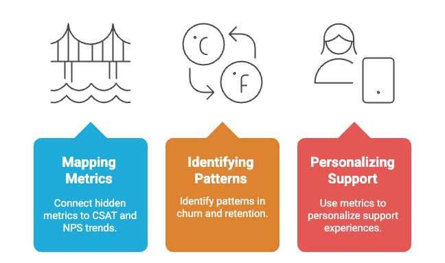
Mapping metrics to CSAT and NPS trends
Quality metrics work like bridges — they connect what's happening behind the scenes to what customers actually feel. When your hidden metrics get better, satisfaction scores usually follow. It's not magic, just cause and effect.
Here's what works:
Track your metrics alongside CSAT and NPS scores over time. Look for patterns — which metrics move together? Which ones predict satisfaction changes before they happen? Build dashboards that make these relationships obvious.
Quality metrics like defect rates and team performance show you how well you're meeting customer expectations, which directly affects whether people will recommend your brand. CSAT tells you about specific moments, while NPS reveals long-term loyalty. Both matter, but they're measuring different things.
Suggested read: Learn how CSAT, NPS, and CES stack up—and which tells you the most about your customers’ experience.
Identifying patterns in churn and retention
Here's something most companies miss — your hidden metrics often scream "this customer is about to leave" long before they actually do. Employee satisfaction connects directly to customer motivation and team performance. Happy agents create happy customers. Not exactly shocking, but worth tracking.
Churn and retention work together like two sides of a coin. Retention measures who stays, churn tracks who leaves. You need both to see the full picture.
Watch for these warning signs:
High escalation rates often mean customers will bolt later. Sentiment scores that keep dropping? That's trouble brewing. Failed self-service attempts pile up frustration until something breaks.
Customer effort score predicts loyalty better than almost anything else — 94% of low-effort customers plan to buy again, compared to just 4% who had high-effort experiences. Track CES by customer segment and you'll spot who's most likely to walk away.
Using metrics to personalize support experiences
BSH Group bumped their conversion rate by 106% just by tailoring experiences to individual customer journeys. That's not luck — that's data working hard.
Smart personalization looks like this:
Use sentiment analysis to read the room and adjust your response. Dig into interaction history to understand what this specific customer needs. Let machine learning predict problems before they happen.
Customers expect this now — 73% want better personalization as technology gets smarter. Companies are using AI to analyze thousands of interactions and deliver exactly what each customer wants.
The payoff? Businesses that personalize based on service metrics see 60% higher profit margins. Even better — sentiment analysis turns NPS from a static score into living intelligence by showing you the emotions behind the numbers.
Tools and platforms for tracking customer service analytics
Getting the right analytics platform isn’t just about fancy features — it’s about giving your team the power to actually use the data they’re collecting. That’s why choosing the best tools for tracking customer support metrics matters. Leading platforms for tracking support metrics help teams cut through the noise, especially in a market packed with options ranging from all-in-one dashboards to specialized tools focused on specific channels.
Features to look for in a customer service analytics dashboard
Here's what really matters when you're shopping for a dashboard:
- Real-time monitoring gives you instant visibility into how things are going, so you can jump on problems before they spiral.
- Customizable metrics let you track what actually moves the needle for your business instead of getting lost in irrelevant numbers.
- Visual breakdowns through charts and graphs make sense of your data at a glance. Nobody wants to stare at spreadsheets when they could spot trends instantly.
- Filtering options help you dig into specifics — whether that's by time, channel, or individual agent performance.
- Multi-channel tracking shows you where customers prefer to reach out. This matters because your email strategy might be crushing it while your chat needs work.
Don't sleep on AI-generated insights either. These tools can spot patterns you'd miss and connect dots across thousands of interactions. Make sure whatever you choose plays nice with your existing setup — manual data transfers are a pain nobody needs.
Comparison of top tools: SparrowDesk, Zendesk, Sprinklr, Dialpad
Best tools for tracking customer support metrics: Each platform brings something different to the table.
SparrowDesk
SparrowDesk is built for teams that want powerful customer service analytics without enterprise complexity. It combines AI-driven insights, real-time dashboards, and smart automations to surface the metrics that actually matter — response times, resolution trends, backlog health, and agent performance.
With AI Copilot and AI agents working alongside human teams, SparrowDesk helps uncover patterns, deflect repeat issues, and turn everyday support data into clear, actionable insights from a single, modern workspace.
Extract insights from every conversation with SparrowDesk.
Make support data actionable with SparrowDesk
Zendesk
Zendesk keeps it simple with customizable dashboards that surface the metrics you actually care about — CSAT, response times, ticket volume, and agent performance.
Its AI evaluates every interaction, catching knowledge gaps and improvement opportunities you might otherwise miss. Everything connects in one workspace, giving agents the full customer context.
Sprinklr
Sprinklr goes big with 30+ channels integrated without relying on external connectors. Its AI handles much of the operational heavy lifting — filtering spam, tagging priority levels, and automatically routing tickets to the right agents, making it well-suited for large, omnichannel enterprises.
Dialpad
Dialpad stands out for its machine learning depth, scoring higher on ML capabilities (8.3 vs. Sprinklr’s 6.0). This strength makes Dialpad particularly effective for voice-based customer service analytics, including call sentiment, conversation insights, and agent coaching.
These are the leading platforms for tracking support metrics
How to set up alerts for metric thresholds
Alerts turn your dashboard from a pretty display into an early warning system. Here's how to set them up right:
Start by picking which metrics actually need monitoring — SLA compliance, backlog buildup, negative CSAT scores. Set threshold values that make sense for your business. Configure the alert by choosing what to monitor, where the data comes from, and what triggers the alert.
Decide how often to check and how far back to look — maybe "check every 5 minutes, look back 15 minutes". Then set up who gets notified when things go sideways.
You can adjust sensitivity levels too. High sensitivity catches everything but might flood you with alerts. Low sensitivity only flags major issues but could miss early warning signs.
Keep tweaking your setup as your business changes. Well-configured alerts help you catch problems while they're still small.
Real-world use cases of hidden metrics driving improvements
These aren’t just theoretical numbers — companies are using customer service analytics to put hidden metrics to work and see real results. The proof shows up when businesses start tracking what truly matters.
Reducing churn through proactive escalation tracking
A Canadian telecom company had a problem. Their feedback systems were all over the place, and customer satisfaction was tanking. So they connected the dots — integrated omnichannel routing with automatic surveys to actually see what was happening.
The results? A 149% jump in net promoter score and 93% improvement in first contact resolution.
Upscope took a different approach that paid off big time. When their satisfaction scores dropped from 4.96 to 4.82, they did something most companies wouldn't think of — they put their developers directly on customer support calls. Turns out, when the people who build the product hear customer frustrations firsthand, they ask better questions and fix problems faster.
Improving FCR with agent training based on AHT data
Here's where things get interesting — Aeromexico discovered that slowing down actually sped things up. Instead of pushing agents to rush through calls, they focused on giving customers the time they needed. After switching to a cloud platform that showed real-time data, they saw a 13% improvement in FCR and a 90% decrease in average speed of answer.
Sixty-five percent of contact centers found they could actually calculate the value of increasing handle time to boost first contact resolution. One company put it perfectly: they "stopped putting a large focus on AHT because agents became more focused on that than actually providing service".
Boosting self-service with content gap analysis
Think of it like this — if customers can't find answers on their own, they're going to call you. Service directors who really invest in self-service see 60-70% adoption rates within six months, compared to just 20-30% with basic setups.
One hospital figured this out the hard way. They analyzed what people searched for in their knowledge base and found tons of outdated info about appointments, scheduling, and insurance. After updating everything, support tickets dropped while patients could actually find what they needed.
The math is pretty compelling — self-service interactions cost about $0.10 compared to $6-$12 for live agent support. When customers can help themselves and you save money doing it, that's what we call a win-win.
Conclusion
Let's be honest — most companies are still measuring the wrong things.
You’ve seen the data throughout this article. The gap between what customers want and what businesses actually deliver isn’t getting smaller on its own. But here’s what we know works: companies that track the right metrics see 20% higher satisfaction rates, and those using real-time analytics are 23 times more likely to land new customers.
The hidden metrics we’ve covered — first contact resolution, customer effort score, sentiment analysis — aren’t just nice-to-have numbers. They’re early warning systems for your business.
Think of it this way: traditional metrics tell you what happened yesterday. These hidden indicators show you what’s happening right now — and what’s coming next. When that Canadian telecom company saw their NPS jump 149% by tracking escalation patterns, they weren’t just improving scores. They were preventing churn before it started.
The tools exist. The data is there. What separates winning companies from everyone else is knowing which numbers actually matter — and acting on them in time.
This is where insight has to move beyond dashboards and reports. Platforms like SparrowDesk help teams bridge that gap by bringing real-time analytics and AI-driven insights directly into everyday support workflows.
Instead of reviewing metrics after the fact, teams can see effort signals, sentiment shifts, resolution quality, and emerging risks as conversations happen — making it easier to prevent churn, improve satisfaction, and turn customer service into a growth lever rather than a reactive function.
Stop guessing. Act on the metrics that matter with SparrowDesk.
The Helpdesk your team truly deserves.
Your customers are already telling you everything you need to know.
The real question is: are you listening to the right conversations?
Key takeaways
Customer service analytics transforms support from reactive to strategic, with companies seeing 20% higher satisfaction rates when they track the right metrics beyond basic CSAT scores.
• Track First Contact Resolution (FCR) above 70% - Companies achieving high FCR rates see dramatically improved loyalty, as 96% of high-effort customers become disloyal versus only 9% with low-effort experiences.
• Monitor Customer Effort Score (CES) for loyalty prediction - CES outperforms satisfaction metrics in predicting retention, with 94% of low-effort customers planning to repurchase compared to just 4% experiencing high-effort interactions.
• Use real-time dashboards with AI-powered sentiment analysis - Businesses leveraging real-time analytics are 23 times more likely to acquire customers, while AI extracts insights from 80% of unstructured data that manual review misses.
• Connect hidden metrics to business outcomes through escalation tracking - High escalation rates (above 10%) strongly correlate with dissatisfaction and churn, making this a critical early warning system for customer departure.
• Implement omnichannel data integration for complete visibility - Unified customer views across all touchpoints enable personalized experiences that drive 60% higher profit margins and 106% conversion rate increases.
When 80% of customers continue using businesses with fast, convenient service and spend 67% more with them, these hidden metrics become your competitive advantage for building lasting customer relationships while reducing support costs by 15-20%.
Frequently Asked Questions
MORE LIKE THIS
Support made easy. So your team can breathe.


